

Seven of the major paint brands have announced their selected Color of the Year for 2023. Their choices represent what the most dominating shades are going to be for the year going forward, allowing people to be inspired when it comes for them to paint the walls of their homes.
This year, we are seeing a shift to more varied colors, compared to 2022 which featured different shades of green and only a single shade of brown. The mix of muted, jewel-like, deep hues this year shows an appetite to re-introduce more color into our lives.
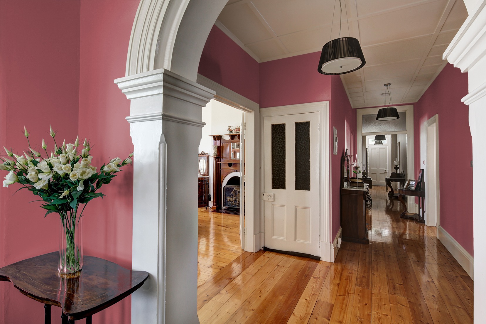
We take a look at how you can incorporate these most popular Colors of the Year into your home, and point out a few ways to avoid design errors with tips and recommendations from color experts and interior designers.
1. Vining Ivy by PPG and Glidden

Vining Ivy has been selected as the color of the year by both PPG and its sister company Glidden. This bold, deep blue/green shade gives a nod to last year’s many green hues while bringing in a new depth and richness of tone at the same time. This deeper and more somber color choice falls in line with some of the other trends predicted to be popular in 2023, including bolder and darker wall colors, and a focus on the colors blue and green in areas like the bathroom. But how can you make the most of this color in your home?
Dos
This color is deep, rich, and fully saturated. Use it in a room with a lot of natural light, or consider making it an accent wall with lighter earthy shades in the room to balance it out. Vining Ivy will make white trim look very crisp and clean against it, but it’s also rich enough to support a more neutral trim color like cream or taupe if the color scheme is a little more muted. Interior Designer Chris Alexakis, from Cabinet Select explains, ''When incorporating this color into a space, it is important to keep the rest of the space neutral and simple, in order to let Vining Ivy really shine''.
Don’t be afraid to use it as a backdrop to the main focus of a living room, bathroom, or bedroom space to create a sophisticated ambiance. According to Interior Designer Maggie Blau, from Hudson Blau, Vining Ivy is a color that ''never goes out of style. It could be used on bedroom, dining room, and living room walls for a cozy and uplifting vibe.'' It's a color that can be dressed up ''with gold tones and would look great as an accent on one wall or a ceiling.''
Don’ts
While dark, bold colors like this can work in many areas, there are a few exceptions to be aware of. If a room is naturally small and dark, this color may enhance that, giving the space a much more somber and enclosed appearance that many people try to avoid.
Although this color works well on accent furniture, steer clear of using it on full kitchen cabinet sets or other major furnishings in the room, as it could overpower the space. Vining Ivy is also a very bold choice for anyone looking to sell their home in the near future, so consider opting for lighter or less daring shades if you’re aiming to make a home more appealing to potential buyers.
2. Blank Canvas by Behr

Blank Canvas has been chosen by Behr as their Color of the Year for 2023. This color can be seen as a warm white, or as a pale, yellow beige with a green undertone. While stark and crisp whites have been popular for the last several years, many people are beginning to gravitate toward warmer whites, which makes Blank Canvas a beautiful fit. Used as a trim or as the main wall color of the room, this shade will create a soft backdrop to the entire space. Yet, this color may not be the perfect fit for all spaces in your home.
Dos
This color is a perfect choice for very large rooms with or without good natural lighting. It will create a warm glow while brightening the space and making it feel cozy and welcoming. Alexakis says, ''I would incorporate Blank Canvas into a living room to create a clean, modern look, perhaps by using it on the walls or as an accent color on throw pillows or curtains. It also works well in bedrooms and bathrooms, especially when paired with brighter colors like pale yellow or light blue.'' Rachel Atkins, Interior Designer at Dwellify adds, “Blank Canvas is a fantastic color for cabinets. It's great for those that want a white kitchen, but don’t want the sterile feeling that a bright white can bring.”
This is a beautiful color to use on the walls of a room that has natural hardwood floors; the warmth of the floors will complement this color perfectly. Or, for a more dramatic appearance, this color can also be used with a dark wenge floor or a deep, black walnut to create a sophisticated and elegant contrast. Blank Canvas is also a good color to paint a home - inside and out - that will be sold soon, and works very well in both contemporary and minimalist spaces. Thanks to its slightly green undertone, it goes well with both blues and greens, making it a perfect soft trim color for a bolder wall choice such as Vining Ivy.
Don'ts
While a warm white can work in most areas, there are a few times when it should be avoided. If the wall colors are soft or pastel in any way, avoid using this color as the trim, as it could wash out the interiors too much. And while it’s a beautiful wall shade, it needs color from other areas in the room to avoid becoming too sterile. If the furnishings are all warm, neutral, and monochromatic, then this wall color may also wash out the room and make the design appear too bland.
Avoid using this color with a variety of cooler, crisper whites in the same room, especially those with different undertones, as they may compete with each other. This also goes for whitewashed floors; avoid using Blank Canvas on the walls to prevent the floors and walls from looking mismatched.
3. Ivory Brown by Valspar

Valspar didn’t select a single Color of the Year for 2023, but created a collection instead. The first color of this collection is Ivory Brown, a warm neutral designed to evoke a sense of nature. This shade is soft and light, much warmer and deeper than a beige or tan. Ivory Brown and other nature-inspired earthy brown shades are very popular hues this year. This is a color that works in nearly any room of the home and gives a fresh new take on more traditional neutrals.
Dos
According to Sue Kim, Valspar’s Director of Color Marketing, “Ivory Brown works best in an open space that needs a comforting mood,” and as a ''foundational shade in a space with many finishes and colors, like the kitchen or living room.” This shade can work well in a kitchen when paired with some crisp whites - either by using Ivory Brown on the walls with white cabinets like the image above, or reversing it for a lighter effect.
Blau adds, ''This color will look great with black or dark brown furniture and blue-toned fabrics.'' If the floors are very light like clear maple or very dark like walnut, this color could work nicely and add some richness to the design. It could also be paired with some natural stones like a Travertine Noce in the bathroom to help create a Wabi Sabi or Japandi design. This color would also look beautiful paired with Blank Canvas as its trim, or set off an accent wall of Vining Ivy in the bathroom perfectly.
Don'ts
While layering several earthy shades together is a perfect way to capture this color in a current trend, make sure not to use other, very similar shades nearby. A medium-brown floor or wall cabinet can make this color look muddy, rather than rich. This color might not be the best choice for a stand-out accent shade; it’s suited to being the main color of the room, and would only get lost or overlooked if used as an accent.
Likewise, if used on smaller furniture pieces, they may get overlooked or lost amidst more robust colors in the room. Kim adds, ''When this warm neutral is used in small spaces like a second bedroom or hallway bathroom, the color sets the traditional style, and the space may feel enclosed.'' Avoid using this color in very contemporary designs, as it may mute a bolder room design.
4. Rustic Greige by Dutch Boy

Rustic Greige is the color selected by Dutch Boy this year, a light neutral color perfectly balanced between gray and brown. Similar to taupe, Rustic Greige is a versatile neutral shade that can pair well with warm or cool tones in the rest of the room. It’s also inspired by nature like many popular colors right now and is designed to be a peaceful, calm hue. This color can also be considered an earthy shade, so it works well with many of the other trending color palettes this year that blend shades of green and earthy tones with one another.
Dos
Rustic Greige is the perfect accent wall in a room with a much lighter wall color like Blank Canvas where its cool tones will contrast the warmer white and make it stand out. It can also be used on walls or nooks as a small accent feature like in the image above. According to Philippa Radon, Paint Color and Design Specialist at C2 Paint, ''This lovely, versatile taupe-like mushroom is an easy neutral for multiple areas and surfaces. It can be used as a grounding color to thread through an entire space with accents of white and creams.'' Like all earthy shades, it also works well when layered with other earth tones.
Deep wenge and walnut browns that have cool undertones as well as rich, warm greens for contrast, or lighter shades of mushroom gray can all work together with this color to create a palette with uncommon depth. Because this color can pair well with both cool and warm tones, it can be used to create both subtle and more dramatic designs. Pair it with a cooler-toned gray, blue, or green with dark wood furniture for a subtle and sophisticated design. Or warm it up with rich, dusty pinks, mauves, and peaches to add depth and warmth to the room.
Don'ts
While layering earthy tones is always encouraged, make sure not to use anything else in the taupe family when using this color to avoid washing out and muddying the room. Go for contrast with either lighter or darker shades, but avoid trying to match this color or using it in too many places at once, as it will quickly become bland and boring without other colors to balance it with.
This color would work well in large spaces that don’t have a lot of natural light but avoid it in small and dim rooms. It needs either space or light to help it shine, and a small and dim room will only make it appear grim and bland. Radon adds, ''I'd stay away from this on a ceiling or north-facing room which might mute the warmth.'' Try to avoid combining greige walls with greige floors as this can also dull and overpower the space.
5. Redend Point by Sherwin-Williams

Redend Point is the color selected by Sherwin-Williams this year. It’s similar to both Rustic Greige and Ivory brown in terms of being an earth-toned shade, but it takes this inspiration to a new level. This color has pink and red undertones, similar to terracotta. It’s very warm and vibrant while staying close to neutral at the same time. This makes it a good choice for anyone that wants to capture some of the earth-toned palettes that are so popular right now, while also creating a very warm, inviting, and cozy space in the home.
Dos
This warm, rich color will work well with many trends this year. From creating a full, earth-toned palette including creams, browns, and greens to working with some of the warmer, dusty pinks and mauves. If you’re using a lighter, earth-toned palette, this color can make a gorgeous accent wall. Pair it with a warm white like Blank Canvas to make a warmer backdrop so it can shine. This color is warm enough to be used in large rooms and formal spaces that need a cozier feeling to them.
It could also be a more sophisticated accent touch for a bedroom or a home office when used in a wall nook or at the back of some bookcases. For a really dramatic contrast, consider using this color with a blue-gray undertone floor like White Oak to make the wall pop against it. Carla Bast, Interior Designer at Carla Bast Design adds, ''I love the idea of adding a touch of Redend Point to your home décor, especially in a mid-century modern or boho space. Use it as an accent color in pillows, throws, or in a piece of artwork. Mix it in with another color of the year such as Ivory Brown by Valspar, or Vining Ivy by PPG. These will pair beautifully together.''
Don'ts
At the same time, it’s important not to use too many shades that are the same tone and saturation, as it will make the room feel too warm and closed in. While this is a good color for dining rooms, it may be too dark and overwhelming for small kitchens and bathrooms, unless they have a lot of white already in there, as well as a lot of natural light.
Alexakis adds, ''One thing to keep in mind is that this shade will definitely draw attention, so it's best to avoid using it in small spaces or on textiles that are easily stained by spills or crumbs.'' Also, make sure that the floor tone isn’t too similar, as it could blur the line from where the floor and wall meet. This can have the opposite effect of making the space feel warmer and more welcoming and can be visually off-putting instead.
6. Terra Rosa by Dunn-Edwards
Terra Rosa is the color choice this year by Dunn-Edwards. This is a very rich pink shade that has been on the rise in popularity this year. Colors like this one are very flattering to the complexion, so they’re popular for bedrooms, bathrooms, and entryways. This color has a warm undertone that allows it to pair well with many earth tones, as well as with some shades of gray, green, and blue. Used as an accent wall or throughout a room, this color is incredibly sophisticated and elegant.
Dos
Terra Rosa is a good color for anyone looking to try a bold color for the first time. It’s rich and saturated, but has a dusty undertone that keeps it from overwhelming the room. Use it as an accent wall and pair it with whites, or choose something deeper like Rustic Greige to be the main color of the room. Alexakis considers that Terra Rosa ''works well with many other colors, including jewel tones like emerald green and deep purple, as well as more muted shades like soft blue or camel.'' He recommends using this color ''in living rooms to create focal points and add a touch of sophistication to the space, or in bedrooms to create a calm and relaxing feel.’’
It’s a good color for intimate spaces like bedrooms and reading nooks because it’s cozy, warm, and uplifting in color. Radon considers, ‘It would be great as an accent wall, bathroom, or a burst of color on a garden wall.’ Look for flooring that has a similar undertone - like red oak - for a more subtle design. For contrast, go for something dark and rich on the floors like greige or walnut to add more depth and gravity to the room.
Don'ts
While Terra Rosa is a more grown-up pink tone, it could quickly tip into juvenile if there are too many other shades of pink in the room. Incorporating many accents that are close to Barbie pink or Millennial pink, could also add a childish vibe to the space. To avoid making it look outdated too quickly, be sure to mix in some contrasting colors into the design. Shades like this are new in popularity, so they may not have the same staying power as other bold shades.
While this color can work well on various walls of a room, don’t use it in spaces that already have an abundance of warm or other saturated shades as well. It will end up overwhelming the room and make it feel too closed in on all sides. Radon adds, ''Because it's so saturated, you might want to use it in smaller doses to avoid it getting harsh on the eyes.''
7. Raspberry Blush by Benjamin Moore

Benjamin Moore’s pick for the year is Raspberry Blush - another saturated tone on the pink spectrum, this one with a warmer undertone that’s closer to red and coral. This color also fits the trend of using bold colors in the home, and is close enough to some of the popular shades of pink to complement them. It’s fun, warm, and energetic in color, which can give any room of the home a very fresh design. Unlike Terra Rosa, which has a cool, dusty undertone, Raspberry Blush is a very warm shade that’s much more vibrant and upbeat.
Dos
Raspberry Blush is a great color for modern and postmodern homes, and can be used in both contemporary and eclectic designs as well. It’s vivid, bold, and very eye-catching. It makes a beautiful accent wall when paired with either a warm white, such as Blank Canvas, or with something deeper like Redend Point. According to Deanne Bridenstine, from Pure Design Interiors, ''Raspberry Blush is the perfect color to add a splash of joy. If monochromatic is more your style, pair this with a red and pop of cherry blossom pink.''
This is such a warm shade that it will work best with the majority of the other tones in the room warm as well. This means using warm wood on the floor like red oak or cherry, and predominantly warm-toned furnishings. For contrast, consider using blue/gray accents to pop against the warm walls. Or, if the floors are cooler in tone, this color on the walls can create a very vibrant look for the room, as long as there are some warm neutrals mixed in to help calm the design down. For anyone that wants to incorporate a bold color in a small amount, this is a good shade for small accent furniture pieces, or to use in nooks and niches.
Don'ts
This vibrant shade of red-orange is quite bold, and if it’s not used right, it could be intimidating for some users. Avoid using this color in a formal room like a dining room, or in small rooms where it may overwhelm the space. This color is very charismatic, so it needs to be the boldest color in the room; don’t mix it with other equally rich shades, or they could vibrate visually and be disquieting and difficult to look at. Radons believes that, ''Such a stimulating color is not ideal for rooms wanting a calm and restorative vibe.''
This color is good for very large spaces, as it can make them feel vibrant and cozy at the same time, but it’s terrible for small rooms - even well-lit ones - where the walls may start to feel as though they are closing in. If unsure of such a big color, it’s best to stick to accents as committing to it everywhere may end up making it too much for a space where only soft colors may have been used previously.
Bold, Warm, and Earthy: 2023’s Colors of the Year for Your Home
While most of this year’s colors have moved away from lighter green tones, many of these shades are still evoking nature, and the serenity and stress relief these colors bring. But, 2023 is also predicted to show a bolder attitude, with darker, richer, and more saturated shades. These vivid tones will make homes feel more personal, upbeat, and optimistic.
However, while some of these shades will work for any home, not all of them may be the best fit. Before incorporating these - or other color trends - into your home, make sure that the home’s style, and the homeowners’ personal preferences are considered first. This will help create a more successful and lasting design, no matter how trendy the colors become.